
The Night I Sacrificed is a conceptual black metal album designed to channel the stark, nihilistic aesthetics of Scandinavian metal culture. The project explores themes of delusion, false devotion, and self-destruction—universal stories of corrupted belief systems rendered through haunting visuals.
The design objective was to create an album identity that embodied the bleak grayscale tone of traditional black metal while weaving in an unsettling, narrative-driven visual story.
The Challenge
Black metal has an instantly recognizable aesthetic—raw, chaotic, and often grim in tone. The challenge here was to honor the Scandinavian roots of the genre without slipping into cliché. The visuals needed to:
- Evoke death and decay without relying on overused tropes.
- Feel “sketchy” and imperfect, echoing the DIY rawness of early black metal albums.
- Capture narrative depth, building a story around false gods, delusion, and obedience.
- Maintain cohesion across internal spreads, covers, and promotional material.
Research & Inspiration
I studied both visual and cultural aspects of the black metal tradition:
- Album art: stark, grain-heavy photography, hand-drawn elements, and high-contrast monochrome palettes.
- Scandinavian folklore & religion: imagery of ritual, sacrifice, and bleak natural landscapes.
- Printmaking and sketch techniques: rough, hand-rendered qualities to enhance imperfection and unease.
Moodboards included weathered parchment, smeared ink textures, hand-etched symbols, and Norwegian black metal album covers from the 1980s–90s.
Process
- Concept Development
- Anchored the project in a narrative: a tale of obedience to false gods, a descent into ritual sacrifice.
- Built a storyboard of imagery to reflect different stages of delusion and despair.
- Visual Experiments
- Developed hand-sketched illustrations and distressed textures.
- Pushed grayscale palettes toward extremes, using sharp contrast to mimic moonlit darkness.
- Layered eerie, atmospheric backgrounds with abstract forms suggesting ritual and decay.
- Typography & Layout
- Selected typefaces inspired by Scandinavian blackletter and rune-like glyphs.
- Customized letterforms to feel jagged and unstable, reflecting chaos.
- Composed layouts that felt claustrophobic, with imagery pressing against the frame.
The Solution
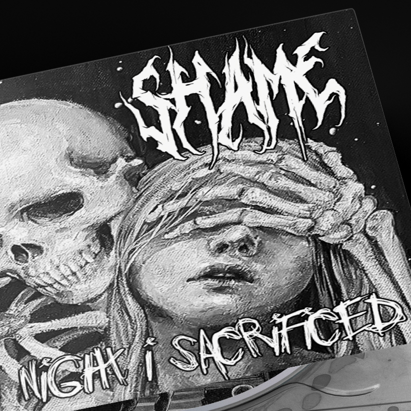
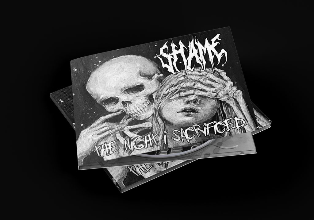
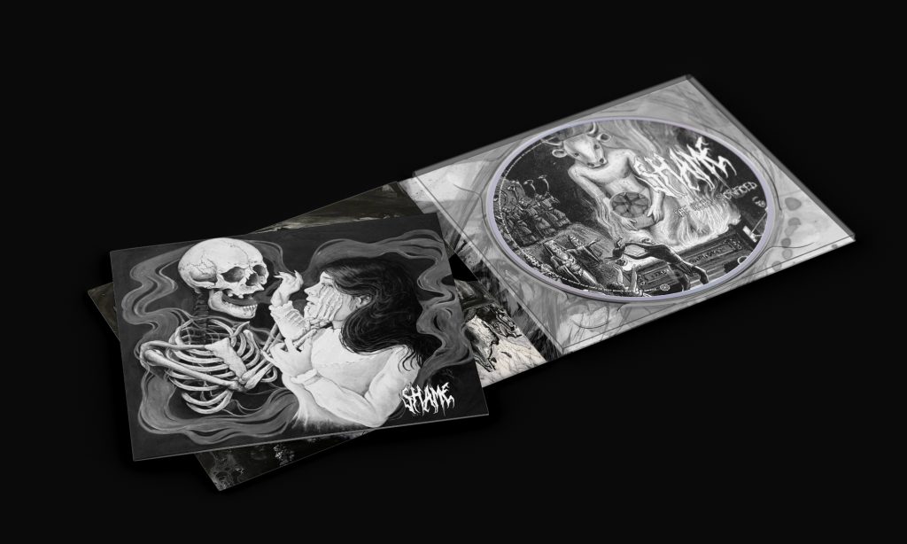
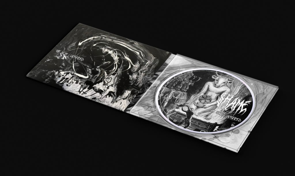
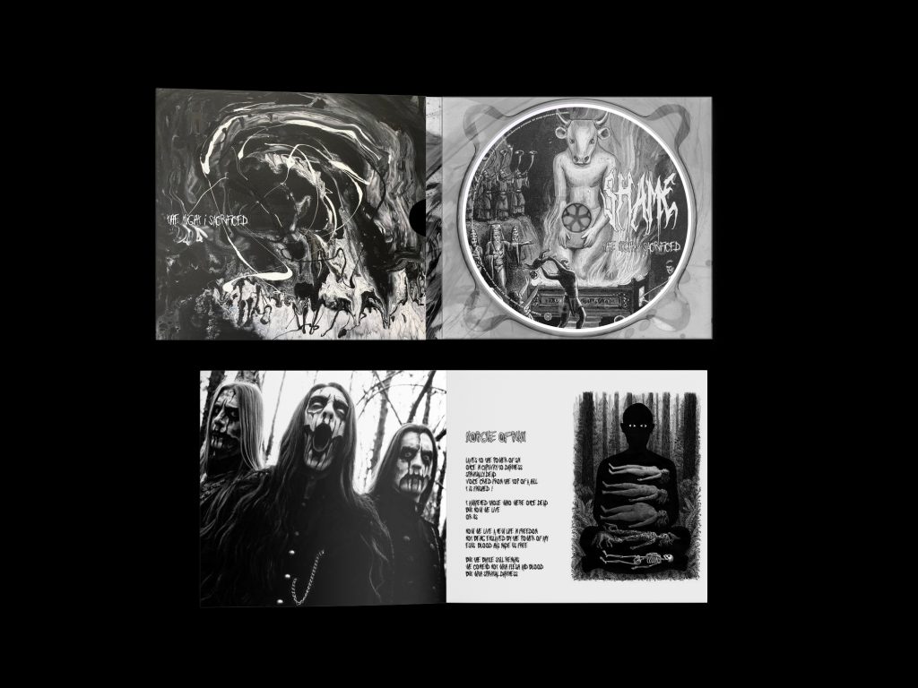
The final identity for The Night I Sacrificed reflects both the rawness of black metal and the haunting nature of the story:
- Imagery: Creepy, hand-rendered sketches layered with distressed textures to amplify unease.
- Typography: Custom, rune-like letterforms that feel ancient and foreboding.
- Palette: A stark grayscale scheme that emphasizes shadow, emptiness, and inevitability.
- Narrative: Internal spreads function like chapters—each one depicting stages of delusion, obedience, and collapse.
Deliverables included a full album package: cover art, lyric inserts, and poster mockups, unified by the same oppressive atmosphere.
Impact
As a conceptual project, The Night I Sacrificed showcases how design can extend beyond surface-level genre tropes into storytelling. It pushes the black metal aesthetic toward a more narrative-driven, psychological direction, amplifying the music’s themes of despair and death.
The project sharpened my skills in:
- Crafting design systems rooted in cultural and musical traditions.
- Using imperfection and texture as deliberate design tools.
- Blending narrative concepts into a cohesive visual system.
Reflection
This project reaffirmed the importance of authenticity in genre design. Black metal thrives on rawness and imperfection, and leaning into those qualities—rather than polishing them away—created a truer and more powerful outcome.
If expanded further, I would explore motion visuals (grainy video loops, animated sketches) and stage projections, extending the story of The Night I Sacrificed into the realm of live performance.