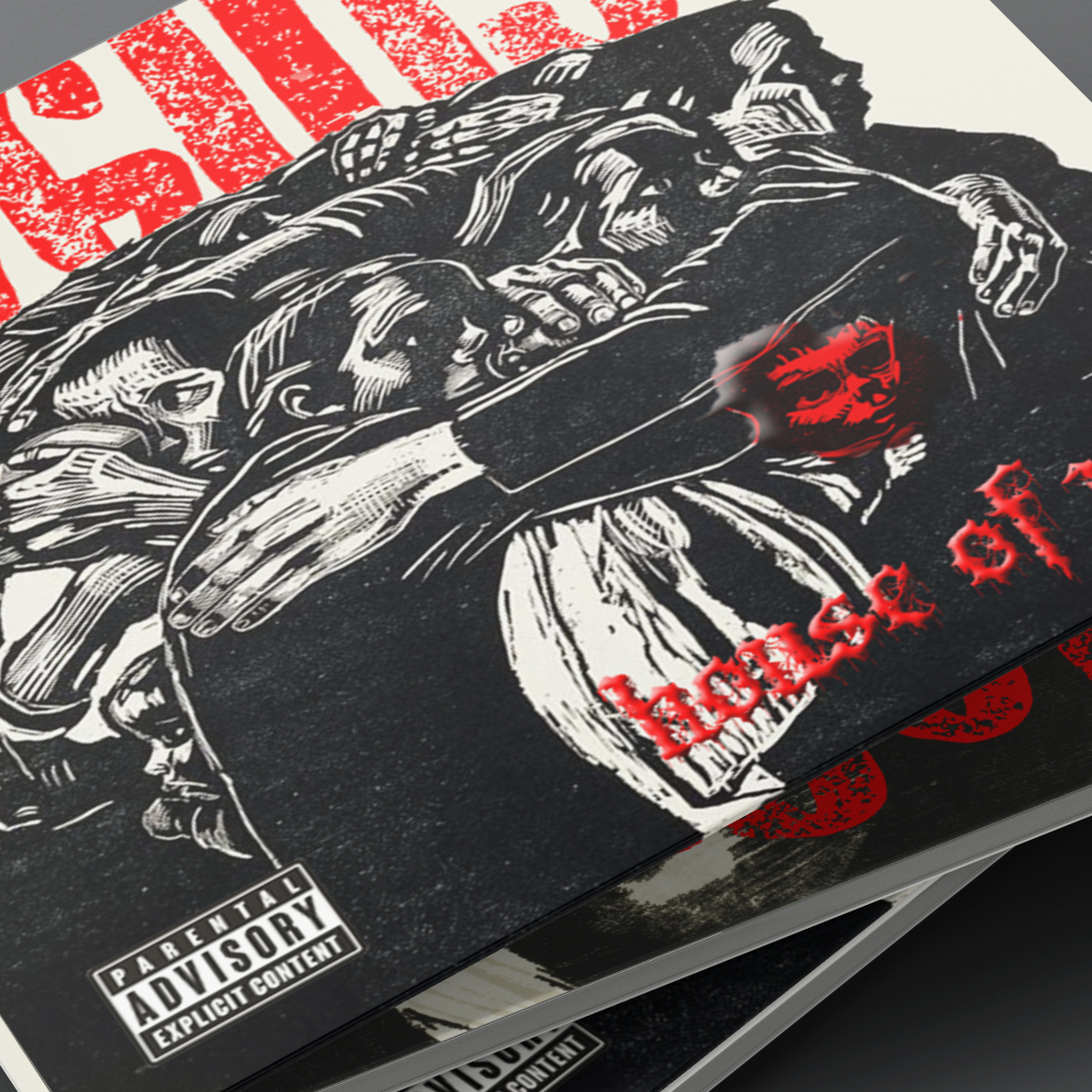
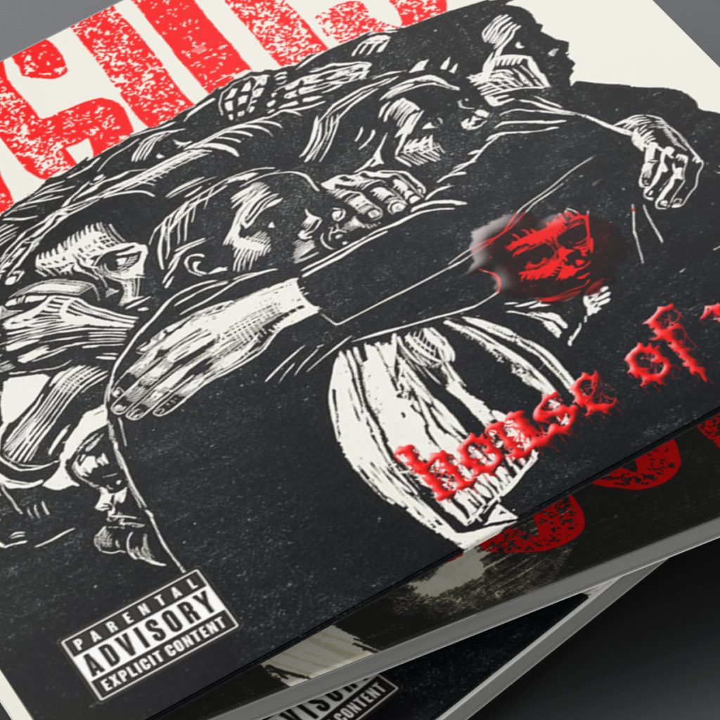
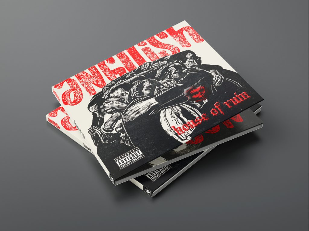
This conceptual project explores how visual art and music can collide to amplify emotion. House of Ruin is an imagined death metal band whose debut album, Anguish, takes inspiration from the prints of German artist Käthe Kollwitz. Known for her haunting black-and-white works, Kollwitz masterfully conveyed grief, loss, and the human condition.
The design challenge was to translate these dense, expressive prints into a contemporary album identity that embodies the consuming nature of loneliness, while still honoring the integrity of the original art.
The Challenge
Death metal visuals often lean on aggressive distortion, heavy symbolism, and raw texture. However, this project needed to balance that intensity with the subtle depth of Kollwitz’s emotional resonance. The typography had to enhance the imagery without overshadowing it, while the overall system needed to feel authentic to both metal culture and fine art traditions.
Key challenges included:
- Respecting the gravity of Kollwitz’s original work.
- Avoiding clichés of the metal genre while still feeling authentic.
- Creating a cohesive visual system that supported both album artwork and band identity.
Research & Inspiration
I began by immersing myself in two worlds:
- Fine Art Context — studying Kollwitz’s prints, her handling of density and negative space, and her ability to render human suffering with stark simplicity.
- Metal Culture — analyzing death metal album covers and band identities, noting common tropes (sharp typography, layered compositions, macabre imagery) and exploring how to reinterpret them through a printmaker’s lens.
Moodboards included:
- High-contrast etchings and woodcuts.
- Traditional blackletter typography and its modern variations.
- Layered textures that simulate ink saturation and paper grain.
Process
- Image Selection & Pairing
- Curated Kollwitz prints that captured themes of grief, anguish, and solitude.
- Considered how each image could serve as a visual metaphor for the album’s tracks.
- Typography Exploration
- Developed print-styled lettering inspired by old-world typefaces.
- Modified forms to harmonize with the imagery, ensuring the type felt like a natural extension rather than an intrusion.
- Layout & Composition
- Used restrained grids to give the imagery breathing room.
- Applied layering and tonal adjustments to simulate the depth of printmaking.
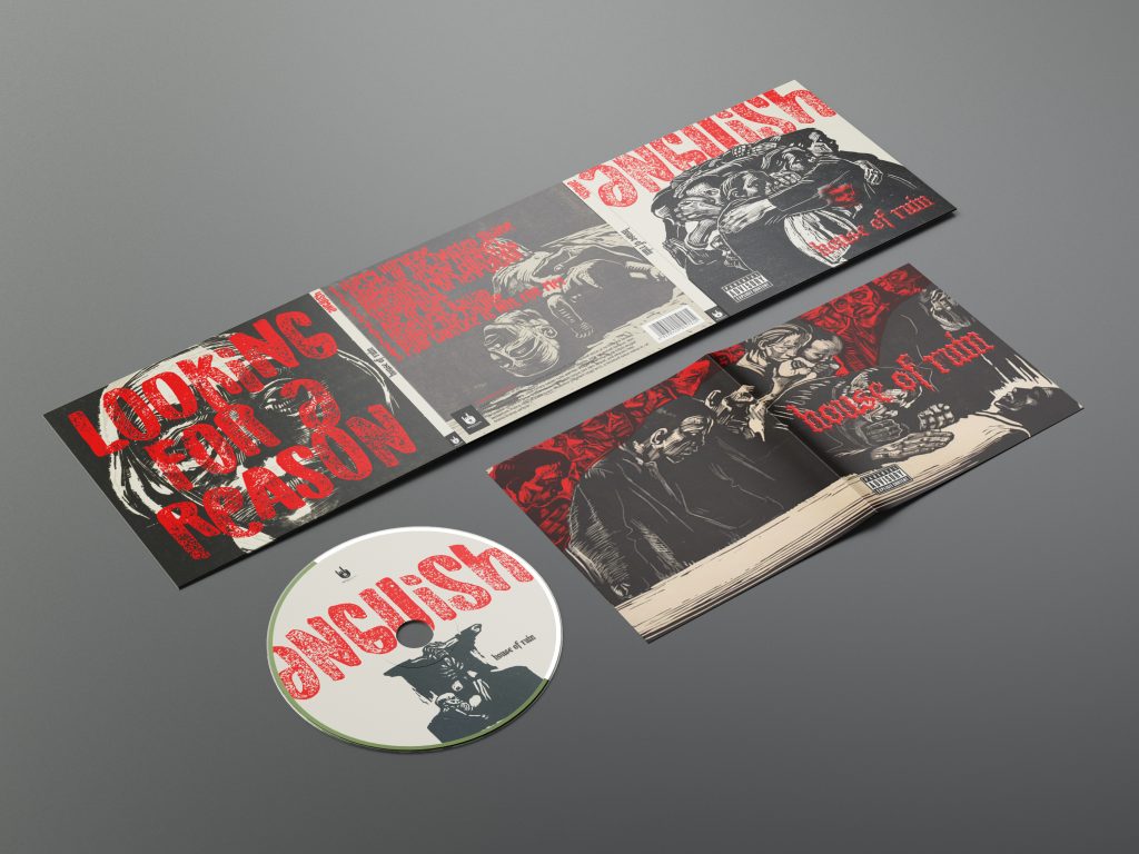
- Created mockups for covers, inserts, and promotional materials to test scalability.
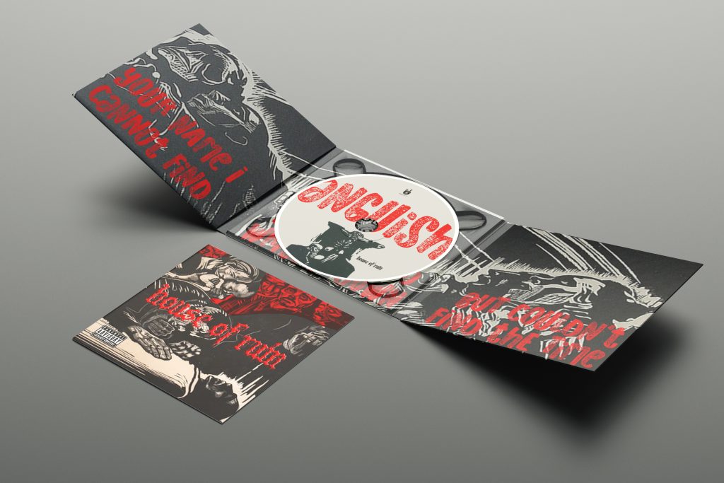
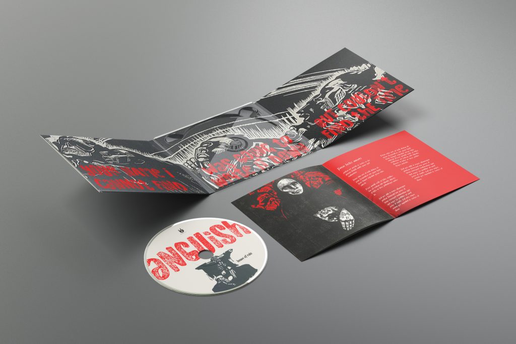
The Solution
The final identity for House of Ruin — Anguish communicates a raw, emotional heaviness without resorting to excess.
- Imagery: Käthe Kollwitz’s prints anchor the system, providing timeless emotional gravity.
- Typography: Angular, print-inspired forms echo the density of etching while remaining understated, ensuring the images remain central.
- Palette: Black and white dominate, emphasizing stark contrast and emotional intensity, while subtly referencing the aesthetics of both printmaking and metal culture.
- Applications: Album cover, lyric insert spreads, promotional posters, and social graphics—all designed to feel like extensions of the art rather than reinterpretations.
Impact
Though conceptual, the project highlights the powerful intersection of fine art and music culture. By pairing Kollwitz’s imagery with a contemporary death metal identity, the work bridges audiences—inviting fans of heavy music to engage with fine art and vice versa.
This project honed my ability to:
- Translate emotion across mediums (from printmaking to music branding).
- Use typography as a supporting element rather than a dominant force.
- Balance reverence for source material with creative reinterpretation.
Reflection
Anguish was an exploration in restraint. The biggest lesson was recognizing when design should step back to let the art speak. By resisting the urge to over-design, I created a system where typography and layout amplify rather than compete.
If expanded, I’d explore motion graphics that simulate etching marks coming to life with music—bringing the intensity of death metal into dynamic visual storytelling.