VPAY is a digital payment app designed to let users convert cash into credits, which can then be spent seamlessly across multiple arcade locations within one system.
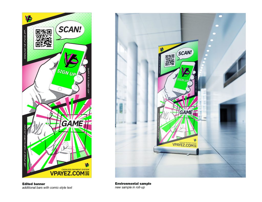
I was tasked with creating a visual identity and communication design solution that explained the app’s functionality at a glance. The challenge was not just clarity but scale: the work needed to live on a 7-foot banner, drawing attention in a busy environment while remaining instantly understandable.
The Challenge
Arcade environments are fast, loud, and visually cluttered. A banner in this space competes with lights, sounds, and movement. My design had to:
- Explain the app’s flow quickly — cash ➝ credits ➝ play.
- Build a recognizable graphic identity for a product that didn’t yet have a visual system.
- Stay legible and bold at large scale, without overwhelming the audience with detail.
- Maintain an approachable, playful feel aligned with arcade culture.
Research & Inspiration
To find the right visual language, I looked at:
- App onboarding flows and how they communicate simplicity through iconography and step-by-step breakdowns.
- Arcade culture visuals—bright color palettes, bold geometric shapes, and approachable typography.
- Wayfinding and signage design, since the banner would act as a kind of instructional guide in a crowded space.
From this, I pulled two key directions: clarity of flow (using arrows, simplified icons, and sequential layouts) and arcade-inspired personality (color pops, playful typography).
Process
- Mapping the Flow
- Broke the app experience into three intuitive steps: load cash ➝ convert to credits ➝ play games.
- Sketched icons for each stage: wallet/money, credits/tokens, arcade machine.
- Visual Identity Development
- Experimented with typography that was clean and modern but had a hint of arcade styling.
- Created a palette with strong contrasts so the message would pop even in a neon-heavy environment.
- Balanced simplicity with energy—graphics needed to be bold but not distracting.
- Scaling for Banner Format
- Designed modular elements so that the flow could be read both up close and from a distance.
- Tested hierarchy: the app name needed instant recognition, while the flow sequence guided the eye naturally from left to right.
The Solution
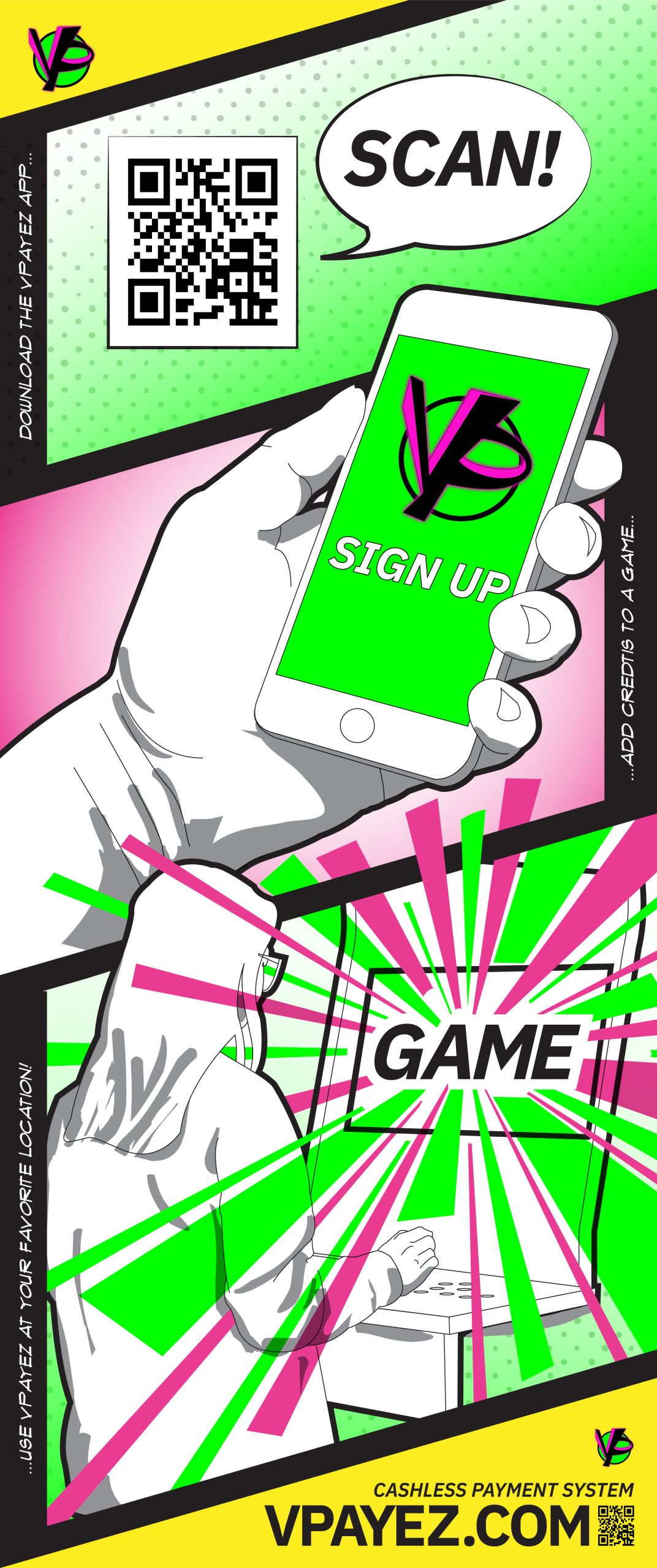
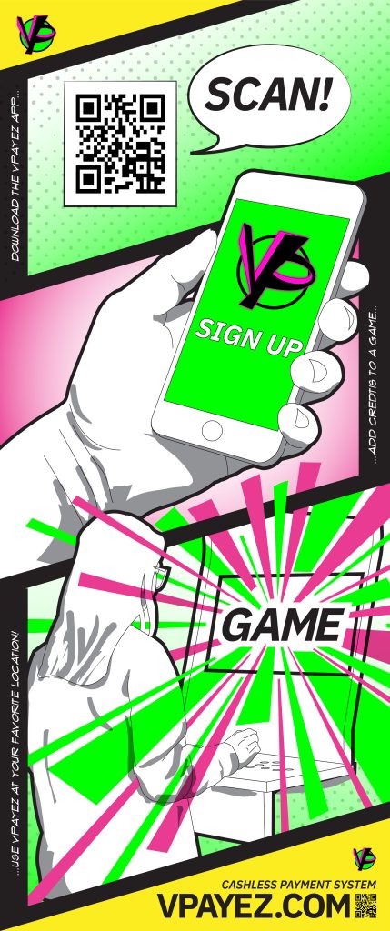
The final 7-foot banner communicated VPAY’s function with clarity and energy:
- Icons + Flow Arrows: Illustrated the step-by-step journey from cash ➝ credits ➝ play in a single glance.
- Typography: A bold, geometric logotype for VPAY paired with clean supporting type.
- Palette: Bright accent colors against neutral backgrounds, ensuring high visibility in arcade settings.
- Composition: A left-to-right flow structure that mimics app onboarding screens, scaled up for physical space.
Impact
The banner succeeded in creating immediate recognition for a new product in a crowded environment. Attendees could instantly grasp how VPAY worked without needing explanation, helping build trust and lowering the barrier to trying the app.
This project strengthened my skills in:
- Information hierarchy and flow design at a large scale.
- Translating app-based user experiences into physical, event-based communication.
- Balancing playful branding with clarity of instruction.
Reflection
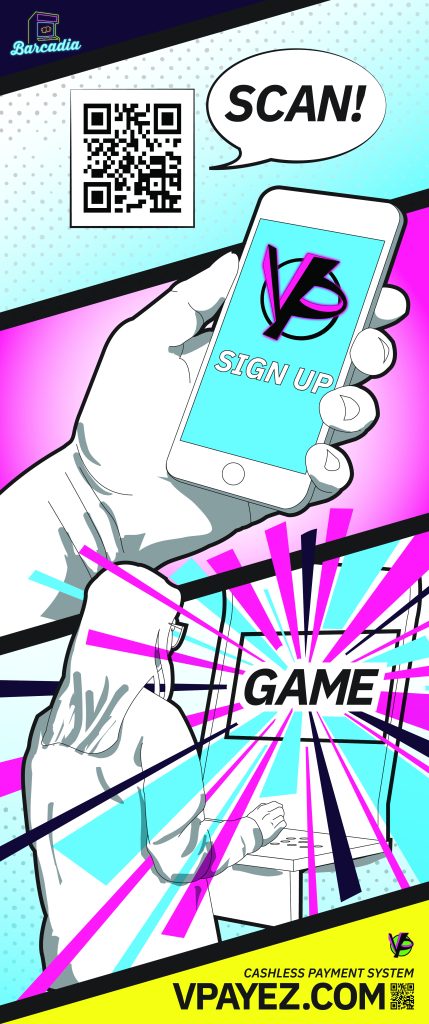
This project taught me that designing for large-format environments requires a different mindset than designing for screens: simplicity, clarity, and bold hierarchy are paramount. For future iterations, I’d expand the visual system into other touchpoints—posters, handouts, and in-app graphics—to create a consistent ecosystem around VPAY