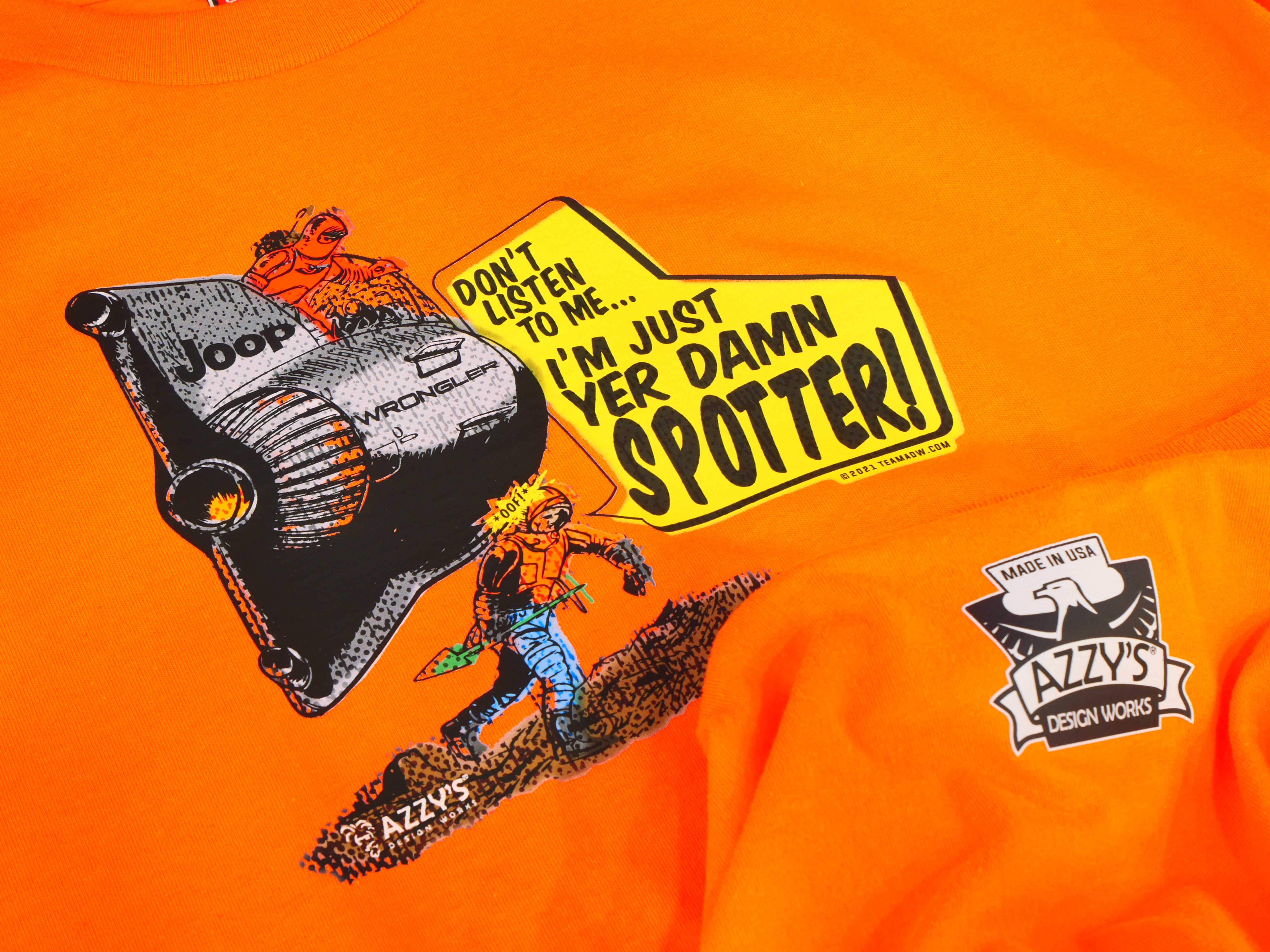
This project explored the quirks, frustrations, and joys of Jeep ownership through a series of illustrated stickers. From leaking fluids in the driveway to driveshaft mishaps on the trail, the series celebrates the unique culture surrounding these beloved but unpredictable vehicles.
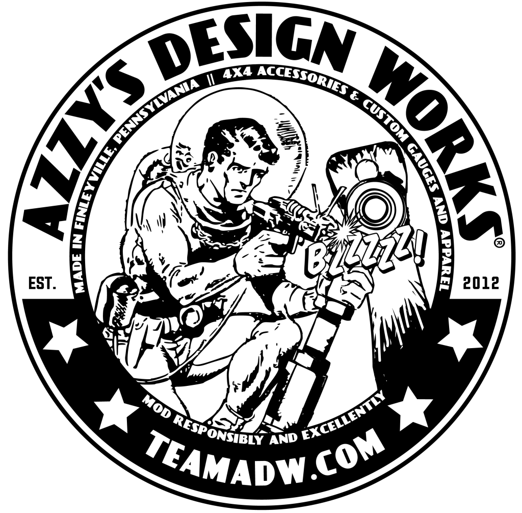
The goal was to create visually engaging, humorous designs that Jeep owners could identify with, while drawing inspiration from old-school sci-fi comics to give the illustrations a nostalgic, playful edge.
The Challenge
The challenge was to:
- Capture the humor and shared experiences of Jeep life in a way that would resonate with owners.
- Blend retro sci-fi comic aesthetics with automotive themes.
- Create distinctive illustrations that could function as standalone stickers yet feel part of a cohesive series.
- Balance detail and readability so that the humor and references were immediately clear at sticker scale.
Research & Inspiration
To inform the visual direction:
- I studied classic sci-fi comic books for exaggerated line work, bold shading, and dynamic compositions.
- Explored Jeep culture online and in real life, capturing common mishaps, memes, and lingo.
- Compiled visual references for sticker design: small-scale legibility, color contrast, and simplified compositions that pop.
Process
- Concept Sketching
- Brainstormed Jeep-specific scenarios (fluid leaks, driveshaft failures, off-road triumphs).
- Roughly sketched compositions in the style of retro comics.
- Illustration & Style Development
- Developed hand-drawn line art, emphasizing dynamic, exaggerated forms.
- Introduced sci-fi inspired elements: alien-like mechanics, futuristic landscapes, and comic-style sound effects.
- Color & Typography
- Limited, bold color palettes for clarity and punch.
- Incorporated retro lettering styles reminiscent of vintage comics for captions and taglines (“Smiles Per Gallon,” etc.).
- Iteration & Refinement
- Tested small-scale legibility for sticker format.
- Adjusted line weight and color contrast to ensure humor and visual clarity at print size.
The Solution
The final sticker series delivers a fun, cohesive visual system:
- Humor: Each sticker references a relatable Jeep experience in an exaggerated, tongue-in-cheek way.
- Aesthetic: Retro sci-fi comic style with bold lines, dynamic compositions, and classic color accents.
- Cohesion: Despite individual scenarios, the series shares a consistent visual language through line treatment, color, and typography.
Deliverables included a set of vinyl-ready illustrations suitable for stickers, social media promotion, and Jeep-themed merchandise.
Impact
Though a playful side project, the series effectively connects with a niche audience, highlighting shared Jeep experiences with humor and nostalgia. It demonstrates how illustration and design can amplify culture, personality, and storytelling in a small format.
This project strengthened my skills in:
- Translating humor and narrative into concise visual storytelling.
- Designing for small-format print with high visual impact.
- Blending retro illustration styles with modern themes.
Reflection
Jeep Life Stickers reaffirmed the power of niche humor and cultural reference in design. By merging automotive culture with comic-inspired art, the work shows that even small projects can build personality, community, and recognition.
If expanded, I’d explore illustrated sticker packs for digital platforms and limited-edition print runs for Jeep events or fan communities.