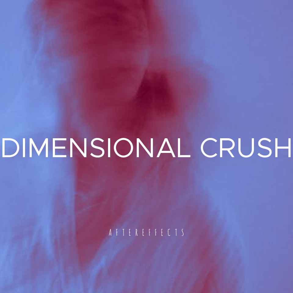
DIMENSIONAL CRUSH is a dark synth concept band. Their track “Aftereffects” evokes a crushing sonic landscape—hollow hallway vocals, pulsating rhythms, and an unnerving sense of vastness collapsing in on itself. The goal of this project was to craft a visual identity that matched the music’s energy and could extend across album art, promotional materials, and digital presence.
The Challenge
The core challenge was translating music that feels simultaneously expansive and suffocating into a design language. The visuals needed to echo the band’s eerie atmosphere while remaining flexible enough for multiple applications. A balance had to be struck between:
- Space vs. density — wide, echoing soundscapes versus heavy, crushing beats.
- Clarity vs. distortion — legible identity while keeping a fractured, uneasy tone.
- Concept vs. usability — experimental design that could still live in real-world formats.
Research & Inspiration
I began by immersing myself in the darkwave and synthpunk genres, studying both sonic and visual references. Moodboards included:
- Distorted VHS textures and analog glitches.
- Retro-futurist typography with a cold, mechanical edge.
- Imagery of collapsing architecture, void-like spaces, and fractured light.
- Poster design from 1980s industrial and underground club culture.
This research shaped a foundation where visual tension could mirror musical tension.
Process
- Sketching & Conceptualization
- Explored rough layouts for album covers and promotional posters.
- Played with contrasts: tight grids vs. broken compositions.
- Visual Experiments
- Layered textures (digital decay, cracked walls, blurred overlays).
- Developed distorted typography to echo reverberating vocals.
- Pushed color palettes toward muted bases with piercing accent tones.
- Iteration
- Tested multiple treatments in mockups (album art, social media banners, live show posters).
- Refined typography to maintain balance between legibility and distortion.
- Adjusted palette to enhance rhythm and movement.
The Solution
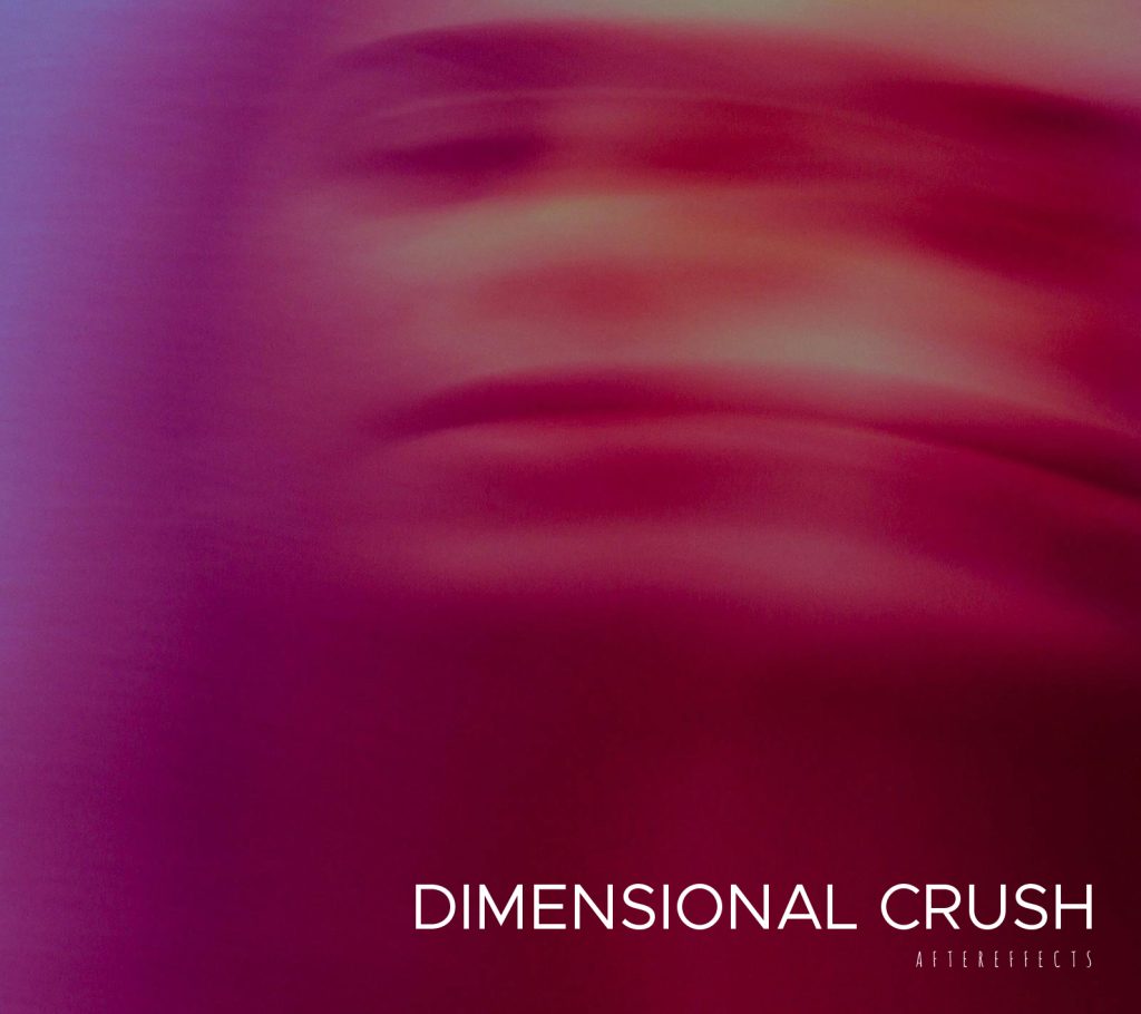
The final identity captures the unsettling duality of “Aftereffects”:
- Typography: Angular, mechanical forms disrupted by distortion and fragmentation.
- Textures: Collapsing surfaces, grain, and digital static that evoke disintegration.
- Color Palette: Dark, muted tones interrupted by sharp, electric highlights—mirroring the push-and-pull of sound.
- Layouts: Tight grids fractured by erratic visual breaks, echoing the pacing of the beats.
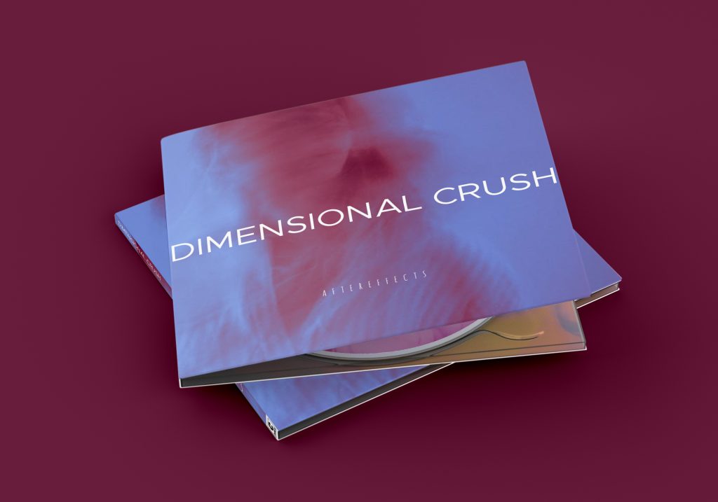
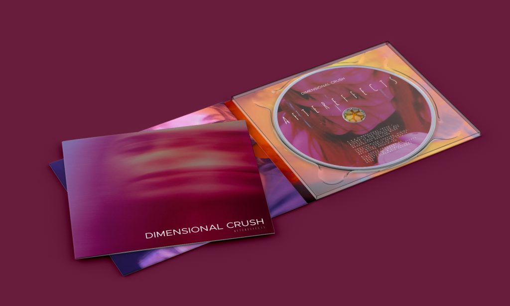
Deliverables included a set of album cover and digital campaign assets that together form a cohesive, immersive identity system.
Impact
While a conceptual project, the work demonstrates how design can extend music beyond sound, creating a multi-sensory experience. It transforms DIMENSIONAL CRUSH’s track from something you only hear into something you also see and feel.
This project sharpened my skills in:
- Translating abstract sounds into concrete visuals.
- Experimenting with typography under controlled distortion.
- Building flexible systems that function across print and digital platforms.
Reflection
“Aftereffects” taught me the importance of tension in design—how pushing opposites (clarity vs. chaos, density vs. openness) can build an experience that resonates deeply. If expanded further, I’d explore motion graphics and stage visuals to bring the identity into live performance contexts.